"There is a culturally ingrained preciousness to fabric. We must not tear, scorch or soil our 'good' clothes. And yet these textiles have a tempting vulnerability. My work is based on the act of violating this taboo."
Tim Harding’s career has encompassed the aesthetic continuum of applied, decorative, and fine arts. He received his BA in studio arts with an emphasis in painting from Hamline University in 1973. He went on to complete additional coursework of at the University of Minnesota, MCAD, and Macalester. Influential figures he studied with include Janite Visscher, Mike Price, Don Celender and James Conaway. Tim transitioned from painting to printing and textiles, and in 1975, he established a silk screen printed supergraphic textile studio called Colorfield Fabrics. In 1983, Tim began his decades long collaboration with spouse/partner Kathleen Harding as Harding Design Studio, part of the fine craft field, art-to-wear movement. He has maintained his current studio practice, Tim Harding Studio, since 1998. His work focuses on large scale commissioned textile art wall pieces.
Tim has received fellowships from the MN State Arts Board, Arts Midwest, and NEA. His work is featured in numerous museum and corporate collections.
Specialty Fabrics Review, July 2025 – Harding heads for Groveland Gallery with new art series
MPLS Art, August 2025 – A Closer Look into Tim Harding’s Stereoscopic Textiles
Museum Collections
Smithsonian American Art Museum-Renwick Gallery, Washington DC
Kwangju Museum of Art, South Korea
Cooper-Hewitt Museum, New York
American Craft Museum, New York
Minnesota Museum of American Art, St. Paul
Minneapolis Institute of Arts
University of Minnesota-Goldstein Gallery, St. Paul
Boston Museum of Art
Santa Fé Museum of Folk and Craft Art
Racine Art Museum
San Francisco Museum of Art
Artist Statement
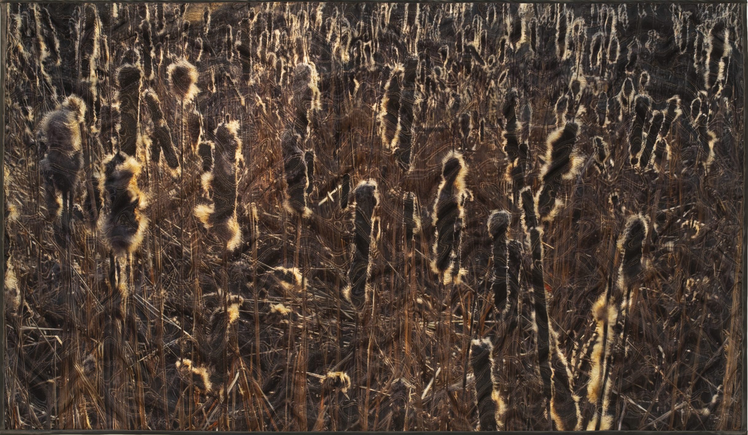
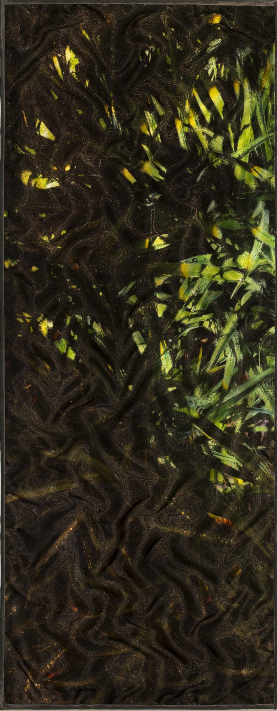
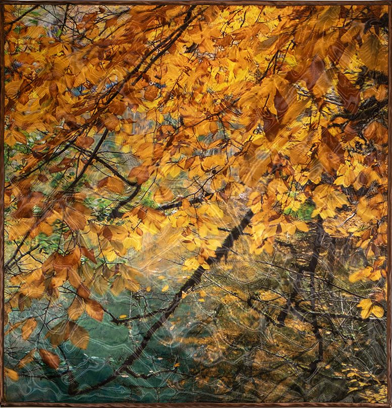
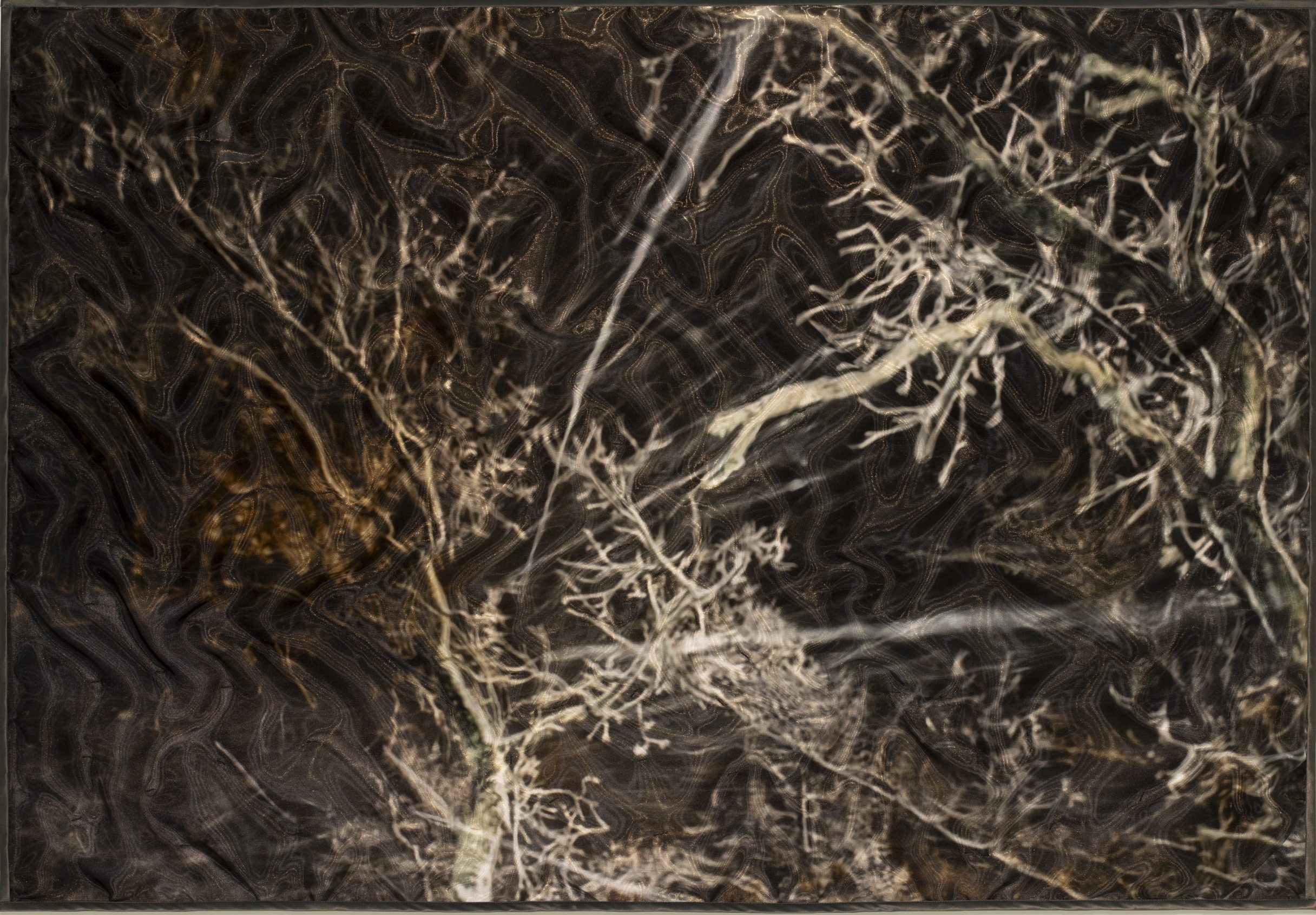
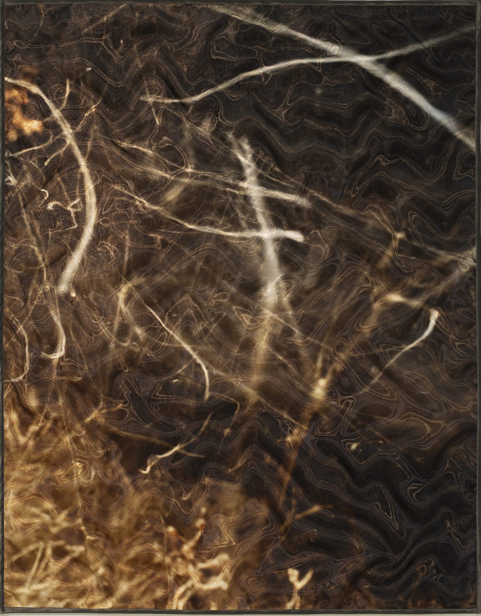
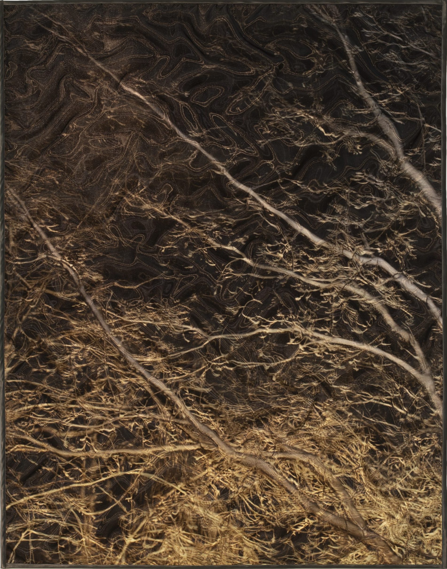
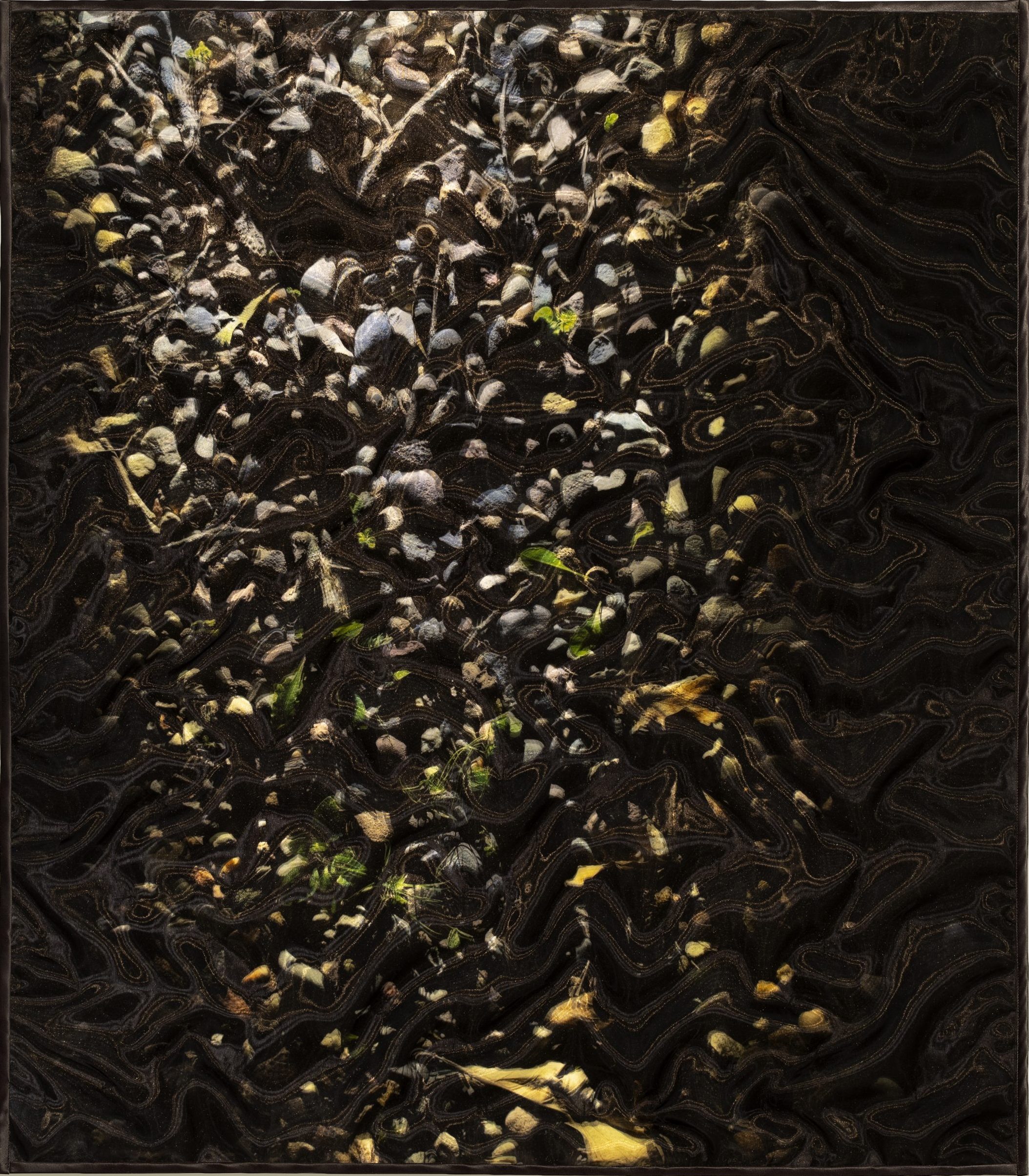
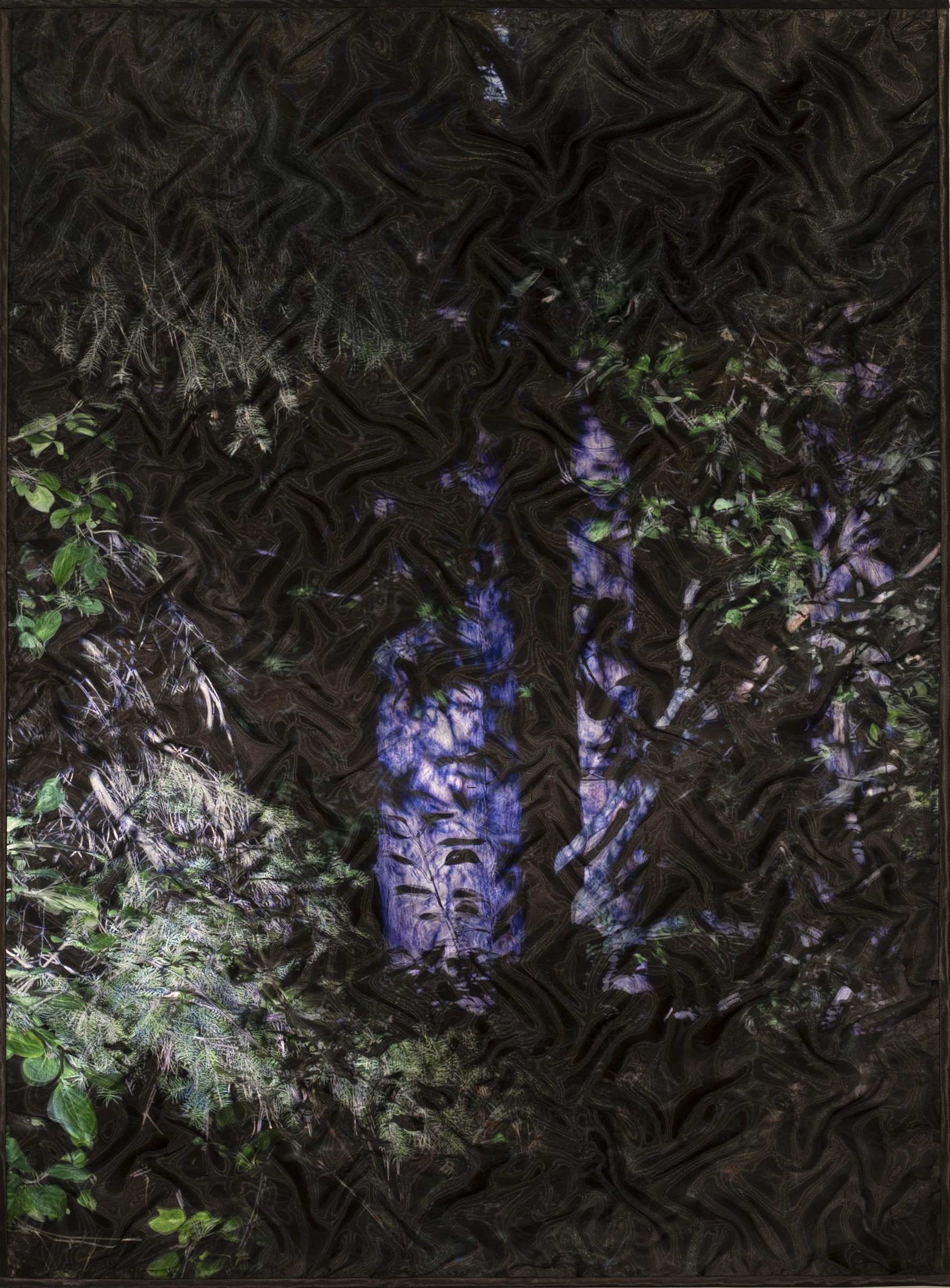
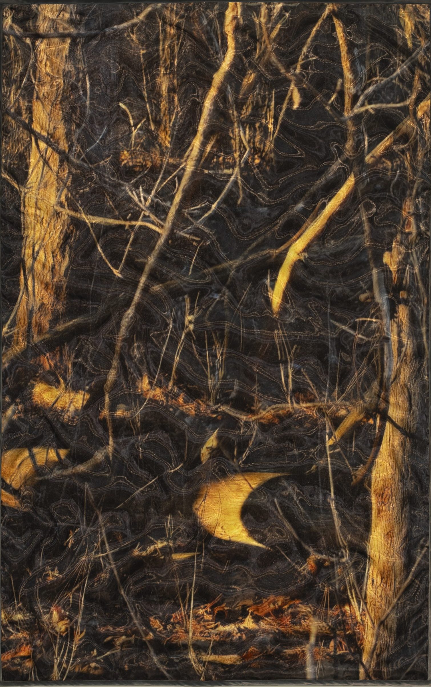
“After working in painting and photography in college, I became intrigued with the intimacy of fiber/textiles; their textural, tactile richness, the pliable plane, the inherent grid of the weave, as well as the complex cultural roles of this medium.
There is a culturally ingrained preciousness to fabric. We must not tear, scorch or soil our ‘good’ clothes. And yet these textiles have a tempting vulnerability. My work is based on the act of violating this taboo.
I use a unique, self-developed physical technique (a complex, free-reverse appliqué) which makes use of the intrinsic properties of my materials while creating an interesting interplay of surface and structure.
In the pursuit of creating the illusion of three-dimensional space on the picture plane, I employ painterly techniques such as light/shadow, figure/ground, and perspective. The pixel-like quality in my work, a result of the physical manipulation, is very conducive to the coloration technique of simultaneous contrast, the use of multiple solid colors in tight proximity to create a vibrant richness, most often associated with the Impressionists and especially the Pointillists.
There is an important layering aspect in my work which I use to obscure and reveal images beneath the surface. In repeating linear grids and wave patterns I’m exploring the relationship of texture to graphics.
The historical references and cultural influences for my work are many and widespread, including: traditional oriental kimono forms, Monet’s impressions of light on water, Rauschenberg’s Jammers and Hoarfrost series, Pattern Painting, the water imagery of Hockney, Fischl and Bartlett, the color portraits of Chuck Close, and the Color Field painting of Rothko and Olitsky. A key influence comes from the profound connection between modern painting and primitive ethnographic artifacts.
The lack of barriers between art and life in primitive and other non-Western cultures inspires in my own work the commitment to pursue aesthetic investigation in a medium (fiber) traditionally outside of our own culture’s fine art hierarchy. A key example of this influence is the Japanese view of the kimono as both decorative art and applied art becomes less important than the fundamental and conceptual beauty of the piece itself.”